
Rodan and Fields
Product Designer
Nov '20 — May '21
User
Rodan and Fields is an e-commerce company that sells skin care solutions. They use multi-Level marketing to sell their products. I designed a tool for sellers to prioritize their tasks that will scale their business, and increase sales over time.
Pain Points
- Less experienced sellers do not know what high impact actions they can take to scale their organization.
- Users reported not knowing how to interact with the current experience. They didn't know how to complete the action leading to abandonment.
- The completion CTA's were hidden in a drawer, which made it difficult for users to complete their action.
Approach
- User Research: uncovered pain points why users were not using "Tasks", and uncover which tasks users should focus on.
- Iterative Design: produced rapid low fidelity iterations to understand project scope.
- Usability Testing: conducted usability tests to test our assumptions.
- Handoff: finalized designs and handed them off to engineering to develop.
Challenges
- Faulty Components: the current components obscured the core functions, which made it difficult for the user to complete their action.
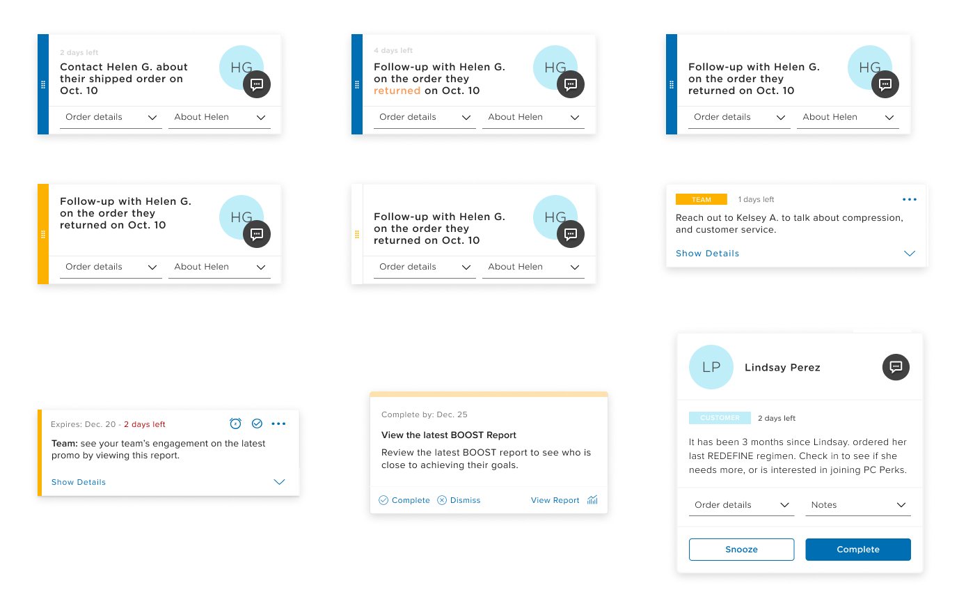
- Identifying the Biggest Win: Changing core components involved a lot of bargaining and change. I identified the biggest win for this project, which was moving the completion CTA's out of the drawer so the user could complete their task. I showed that the more users were able to complete their actions, the more their businesses would scale, and they would sell more products. This showed product that value proposition for implementing this change. Phased Approach: the contact widget existed across the R+F experience, it was difficult to change. I proposed a phased approach to simplify the component to make it easier for the user to interact with.
$350,000+
The number of consultants that use this experience.
+40%
Users reported a 40% increase when comparing the original to the new design


Iterations of the task design. The goal was to bring the CTA’s out of the side drawer so the user knew how to complete their task, which would lead to more engagement.
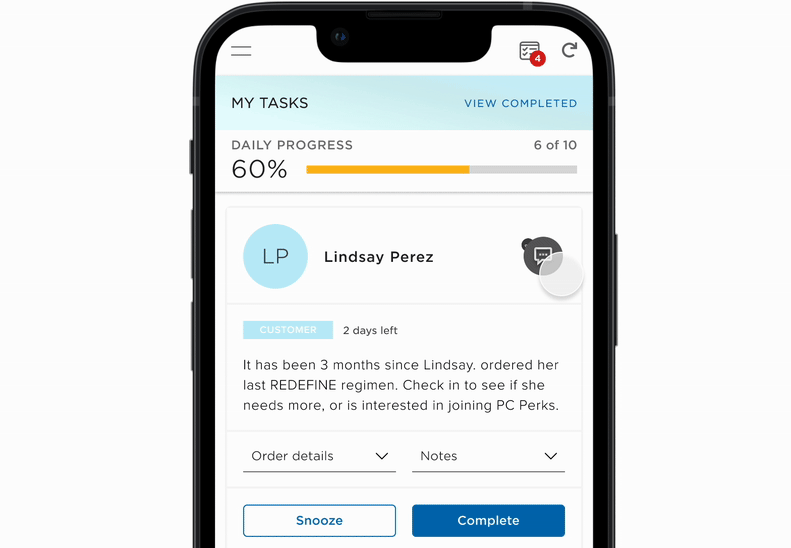
Interactive Prototype
Designed an interactive prototype to validate our assumptions that users would be able to complete more tasks.